Monday 28 January 2013

Monsters (2010) - Gareth Edwards


I've had the film 'Monsters' on my shelf for a while now with the intention of finding out what all the fuss over Gareth Edwards' single-handedly created CGI was, but have never gotten round to it. Since we're focusing on After Effects in this module it seemed the perfect time to finally watch it! And I'm really glad I did.

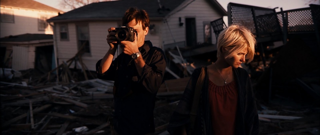
Though marketed in the trailer (and i suppose the title) as a 'Monster Film', 'Monsters' is more like a character driven road trip/ travelling documentary, with naturalistic dialogue and beautiful shots.
Viewings of the CG 'Aliens' are drip fed to the audience, a tentacle here, a blurred news report there, until the final reveal, a clever technique to hold our attention as well as avoid any cliche 'AHH A MONSTTTERRRR' moments. This is a lot subtler in blending the two worlds of real-life and CG than our project and will be something I keep in mind in future projects.


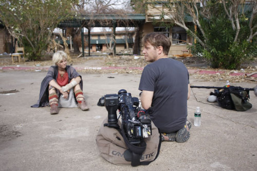
By shooting the footage himself, Gareth Edwards could visualise where he would put effects later and decide on shots and panning as he went. It's incredible how much of this production was improvised, footage being shot with no idea of where it would end up in the film. The small size of the crew allowed them to stop and shoot everywhere, collecting great spare of the moment visuals.

It's amazing that Gareth Edwards created all the CG himself and really adds to the atmosphere of the film. He used After Effects to manipulate most of the signs throughout the shoot to help the narrative in a subtle but effective way. During the shoot he was constantly filming signs etc in preparation for this, so the natural textures/positions help the final outcome be in keeping with the location. Manipulating surroundings is something I want to try, so will look into After Effects tutorials and experiment.


The below is a short film by Gareth Edwards prior to Monsters for the 2008 SCI-FI LONDON 48 Hour Film Challenge. It's nice to see someone who, though initially getting work for the computer skills in his showreel, pursued film using his CG skills as leverage and an added bonus in the industry, for example he was allowed to direct for the BBC because he offered to produce the CG for free. It's encouraging to see someone follow this path, gaining experience and then being given the opportunity to explore their own creative potential fully.

Thursday 24 January 2013

Introduction to Blend Shapes

We were introduced to creating Blend shapes and their possible uses with a simple exercise in Maya. This involved duplicating a simple shape, adjusting them and adding blend shapes. I was surprised at how simple this process was and could see how it could be used to create more dynamic animation.


Though I'm not using Maya to create my Alien I can see how using blend shapes would be extremely useful for facial animation, allowing a range of expressions to be exaggerated and given an interesting design, freeing the face from restrictions of solely using a rig and adding some character to it.

Tuesday 22 January 2013

Introduction to Keylighting Green Screen in Ae

In this tutorial we were introduced to Keying out a Green screen using footage provided. To help us with this we were also given a guide of step by step processes and approximate values to input to achieve the best result.


I was surprised at how quickly a well lit green screen could be keyed out as I had expected the process to be more complex. By selecting the colour of the green screen with the Colour ink dropper in the Keylight Effect the green screen keys out, leaving extra adjustments to be made to the footage, such as Clipping the Blacks and Whites and applying a Simple Choker. Creating a garbage matte around the green screen deletes anything extra in the footage and can be animated around the subject to facilitate movement.

We touched on how to make the footage fit the background such as adjusting the tint (in this case making the green screen composition blue). Creating this highlights the importance of adding little effects to blend the elements of the scene, or example this composition would be improved through adding shadow and perhaps bubbles and movement in the still image. 

Monday 21 January 2013

Colour and Face Development


 I've altered the head design in an attempt to make it's silhouette more pleasing, also by avoiding too much symmetry (shifting the lens to the side slightly) the design is hopefully a little more interesting.

I'm quite taken with the idea of adding burns to the Alien, (as if it were photograph etc) and think the below images illustrate their use to highlight form and brighten colour etc. well. I don't necessarily want the burns to consume the alien, but think there addition would add texture.


More work from the above artist can be found Here.

I've lightened the colours slightly to make the alien seem less threatening than the previous concept art as well as to highlight the 'burn' areas (the oranges etc).


Saturday 19 January 2013

'Concept art' - Alien

I've still got a few problems with my 'alien' design. I think the mask shape is too busy and messy so definitely needs some work (I should think more about the overall silhouette). I've tried to stick to a few key colours (as it'll then be - hopefully - easier to replicate with face-paint), but by cutting out paler colours (white/blue) there's a slight loss of 'alien' quality. The reds and oranges also contribute to an overall sinister look for the alien, which though I do want, I don't necessarily want to this extent. I also think the lens should be highlighted more and perhaps more mechanical elements added..

Wednesday 16 January 2013

Concept Art and Colours


Colour wise I like the idea of the alien resembling aspects of camera and film, but also seeming more 'alive' than robotic. Using earthy natural colours that also resemble film stock and film burns allows me to do this. I am aware it looks very Dave McKean at the moment though (not that that's a bad thing), and may be a little too ambitious to achieve. The idea of burns and fire allows the majority of the alien to be dark (highlighting the head), and the idea of film burn/lens flare works for the stripes. I will have to look into the practicalities of creating this (e.g trying out materials/face paint) and bare in mind I may need an alternate design.


Tuesday 15 January 2013

Alien Development - Shapes and face

Further development for the alien. I've tried to balance the 'Cyclops' look with curves to create a shell like exterior so it doesn't look too tacky.


I've decided the head and (possibly) hands are the most important aspects of the alien, and the rest of the torso etc will be darker/black. This will hopefully highlight and draw the eye to the face where the camera like 'lens' will be. As I am intending to paint an 'actors' face and create a mask for them I have tried to incorporate the human features into the design (e.g the lips etc.) The Key shapes I am using, after referring to shapes of cameras etc, are circles and squares. Below is some quick concept art for the aliens' face.

With this concept art as reference I decided to try some 'make-up' to see how it would look on a face. 


This was using very cheap face-paint and make-up, when I actually make the alien I will have better materials, as well as planned out my colours (as the above images were created a while ago and I have since chosen not to have a blue stripe/white face etc.) I will also have to make sure it blends/matches the mask I make, and doesn't clash too much. The use of stripes helps the 'seam' between mask and face look intended, which I quite like. 

Monday 14 January 2013

Braford Animation Festival (BAF)

During November our course attended the Bradford Animation Festival. It was a great opportunity to see a range of work and hear directly from people in the industry.

A lot of time was spent watching short animations, some which grabbed my attention over others:


The painted quality of the above animation was lovely and gave the film a really organic look, causing the animation to flow quickly. It was like watching a painting come to life which helped draw you into the story easily.

Like the previous animation this one  ( in full here: http://jefflebars.com/videos/ ) is also dark in theme. The style seems to be 3D masquerading as 2D (though probably has aspects of both) and uses colours (black and red etc) effectively. Especially with the child, who is often silhouetted highlighting blood. I found this visually stunning and really enjoyed the short.


We were also shown this short by Jonathan Gales, which I found very impressive and eerily beautiful.

Another aspect of BAF that was of interest and use was a panel held directed at students, specifically 'Student Film'. This gave an insight into what industry professionals were looking for in showreels and potential candidates. Key points I took from this talk was to articulate my strengths honestly and bare in mind what I may be lacking. It also gave a lot of useful tips as to what to include in a showreel. Making it specific to our 'specialism' (if we have one) or our interests.  However the most important thing that I took from this panel was to 'maintain interests in other things' as it will in a way, effect our work.

More initial Ideas and Sketches

Some more ideas and notes on the design of my alien. The alien is going to associate itself with the camera the abductee is holding, so should look similar to a camera in some way (that's why it abducted said abductee). At the moment I am wanting to create a mask/costume for an actor to wear to become the alien, so design wise I am keeping in mind certain limitations this may create. Hopefully through movement as well as design I can make the alien look unnatural and less human.


Thinking about movement and noise, the Alien is meant to be quite mechanical, so will click and jerk about. Colour wise I am beginning to lean towards oranges and off-yellows that will seem slightly like old film, though keeping blue/green/grey/white tinges to preserve an 'unnatural' element. However I need to experiment more with colour once my designs are further developed.


Thursday 3 January 2013

Mirrormask (Film)

'Mirrormask', from the creative minds of Neil Gaiman and Dave McKean, is a film that uses a lot of CG, green-screen and compositing to create a visually impacting dream-world. The freedom of the 'dream' format allows McKean's illustrations to be directly translated onto the screen, giving bold imagery, a style that works in favour of the films low budget as only 15 animators (freshly graduated from art schools) worked on the production. The film's slightly flat and make-shift appearance avoids too much 'realism' (which ultimately would be time-consuming and expensive to produce) and adds a lot of character and atmosphere to the film.


This is of interest to me as I'm aware attempting to be too 'realistic' in this project would probably work against me, so by taking into account the overall style of my 'short-film' (especially my end green-screened shot) and possibly stylising it in some way as to make both characters (an abductee and an alien) visually  belong in the shot I would hopefully have a visually interesting outcome that doesn't look too jarring or tacky.

I really like the masks and costume design in this film. It compliments the CG well as it distorts the human face slightly, highlighting different areas for expression. For example in the case of the Character Valentine the eye is drawn to his mouth, as the rest of his features are covered, and he expresses himself through large movements.


There's an obvious difference between the CG characters in this film and actors in costume. Personally, I prefer the latter as I feel they seem more substantial and solid. Because of this I'm leaning towards using an 'actor' (or more likely a volunteer) to be my alien for my project as apposed to creating it in Maya, though I am aware this may limit my design.

Maya and After Effects were both used for this film with McKean compositing it himself as well as creating the texture maps, a choice which ultimately controls a lot of the aesthetic of the film. Visually the film stands out as quite unique, and I find it impressive it was done on such a low budget. Interestingly McKean allowed the animators to work on their own individual scenes, meaning once they watched the film they could easily point out which work was theres, instead of just being a cog in the machine. This is quite refreshing to see though, and a good influence and inspiration for my own work in this project.