Though I haven't seen either of the Tron films (original and modern version) I'm aware of the cult-like following it has and found the below video really interesting. The interview with the Director of the original Tron, and his thoughts on the comparisons between the processes of creating the original and the modern sequel, highlights just how far animation and special effects has developed - and how important the original Tron was to this process.
The Tron of 1982 (released by Walt Disney Pictures) contains 15 minutes of complete CG content, and was one of the first films of that time to use as much as possible, this therefore has made it be seen, in the industry, as a milestone. Both Tron's combine computer animation and live action, but it seems to be pretty clear that (as it was a more original concept at the time) the original Tron was a lot more impressive, whereas in a culture that takes CG for granted now, Tron: Legacy isn't as 'groundbreaking'.
Tuesday 13 December 2011
Monday 12 December 2011
Muse - Bliss (Directed by David Slade) - Making of.
I love the music video for Muse's Bliss - ( http://www.youtube.com/watch?v=eMqsWc8muj8&feature=g-vrec) I think it's visually stunning and the constant falling echoes the 'flowing' feel of the scales in the song- it creates a sense of speed but also weightlessness because there's never impact. The timing of the cuts compliments the track and different shots (from close ups to wider shots) help give a range of 'intimacy' at some points and 'perspective' at others. It's got a futuristic feel - not only from the subject matter but also through the metallic colours used. And... it's just really cool.
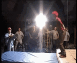 So I found the 'Making Of' Video pretty interesting.http://www.youtube.com/watch?v=GWHo3uZJTpsIt shows the miniatures used for the tunnels and city etc, as CGI was out of budget range (and wouldn't fit the schedule). David Slade (Directors) says: 'There was a lot of 2D compositing though and Smoke & Mirrors artist Rob Maggoch created all the starscape backgrounds entirely in inferno.' I find this making of video really interesting because it's very hands on, there's a lot of physical work to create the movement from the use of miniatures to the use of crash mats. Matt Bellamy was shot using the wires over two days - and apparently ended up being sick from it. The use of wires and fans helps create the weightless feel (as opposed to other techniques in videos for 'falling' - such as having the camera on it's side and using a fan) and I think the video benefits greatly from using them - as it is the main motion in the video. The idea in a way, is quite simple, and by avoiding diverting away from the falling motion adds to the impact and I think creates quite a beautiful film.
Friday 9 December 2011
Stereotype Mood Board

Digital Film - Poetry Films
The second part of the Digital Film brief is to create two 2-minute long videos in response to Poems (One chosen, one given at random).
Our group consists of myself, Siobhan, Rhys and Tom, all taking on different roles. I am focusing on the storyboarding and concept art part - though we all are involved with each aspect of the project in some way, as help with ideas etc. The poem we were given was 'Define Me?' by Zenam Bi and mainly focuses on the concept of being labelled and stereotyped.
We were drawn to the word 'Puppet' in this poem, and researched a little into videos for movement etc. A more detailed/ organised record of our ideas can be found HERE - (By Siobhan - taking on the 'producer' role).
Siobhan found this video which I really like. The movements I think we are trying to achieve for our 'Character' in our concept, will have this 'controlled' feel, but perhaps less mechanical. It gives a slightly dreamy feel - yet shows the lack of choice in movement through the wires.
Our concept involves a woman being controlled like a puppet - as she is 'expected' to act/be a certain way - a certain stereotype. I did a rough concept of this sequence, as we intend for it to be in a light/white space. Things such as amount of ribbon and the look of the girl will probably change through development - for example the girl at the moment has no real 'defining' features (We are considering making her a 'stereotype' e.g a goth or nerd)
Editing and Shot list
Along with my storyboard I wrote up a brief 'Shot-list' for my one-minute film, to make sure I shot everything I intended. - This was easier to use 'on location' that the storyboard.


I also made some rough notes when 'reviewing' my clips before the edit, which helped me get a rough idea of the main 'images' I wanted to use. As well as the moment where I would hopefully add text.

Wednesday 7 December 2011
Maya - Deformers etc.
This lesson of Maya I actually found quite enjoyable as I experimented with Deformers etc, it seemed less 'technical' and a little more creative. Deformers allowed me to twist, bend - in general create many effects, and therefore create interesting quick animations, as I could manipulate shapes with ease. Here are some examples I created:
We also learnt about Hypershade and how to add colours/textures and lighting. I need to experiment a bit more with this, as there are aspects, such as causing something to 'glow' I haven't tried yet.
We also learnt about Hypershade and how to add colours/textures and lighting. I need to experiment a bit more with this, as there are aspects, such as causing something to 'glow' I haven't tried yet.
Modelling and Movement in Maya
We've been introduced to modelling and animation in Maya.
 Truck
Truck
By creating this 'truck' I learnt basic skills such as creating polygons and snapping together objects. In the end I managed to create the model but struggled doing it - finding it a bit infuriating. However I think with more practice I should hopefully become more competent at using the programme. We used tools such as 'Insert edge loop', 'extrude', 'merge' and 'bevel'. As well as hot keys (Z = Undo, Shift Z = Redo) and the importance of deleting
history.

Animating
We were given some activities to create and get to grips with basic animation. These involved making a pendulum swing - which meant manually altering the animation graphs causing different aspects of the pendulum to move at different times - so the 'swing' follows through giving a more naturalistic look.
We also used what we'd learnt with the above animation to create something a little bit more complex, in honesty I struggled a bit with this animation - and it shows with the quick jerking of the pendulum as it stops, I need to work on timing and perfecting editing the animation graphs.
Lecture - Film - Auteur (Alfred Hitchcock)


The Auteur is usually a director who characterises and influences their film, having creative control and 'leaving their mark' on it. An Auteur is seen to start conventions - and not follow them, whilst, due to their technical confidence and use of film language creating a unique style, usually tackling deeper issues and meanings than the ones initially perceived.
This Lecture mainly focused on 'the Auteur' Alfred Hitchcock, and his long career (directing more than fifty films in sixty years). Described as 'The Master of Suspense', Hitchcock has been incredibly influential in film, especially to psychological thrillers and slashers, having said:
'There is no terror in the bang of the gun, only the anticipation of it'.
His work is not art-house and attracts mainstream audiences, illustrating that cinema can involve innovative styles and framing whilst also attracting attention.
His mastery of suspense and causing the mundane to seem macabre has even created the phrase having a 'Hitchcock Mindset'. By using a clever use of montage and cuttings he creates tension even in quite 'normal' settings, leaving the audience in anticipation. This is illustrated in his famous 'Shower sequence' in the film 'Psycho'. Hitchcock also made effective use of techniques and equipment to enhance his story-tellings, for example by using the Dolly Zoom in his film 'Vertigo'.
However, the concept of a film being influenced by an 'Auteur' usually causes the roles of other members of the film crew to be overlooked. For example having a good storyboard artist could be a 'making' point of the film, yet credit would be given to the Auteur despite the fact they can never fully be in control of all aspects of the film, for example a good Actor may influence the actions of their character.
Monday 28 November 2011
Storyboarding - Thinking about Shots etc.

My story board for my one minute video - thinking about things such as Close-Up (CU) shots and Mid-shots and the order they occur in. (For example a wider shot is used as an 'establishing' shot). I've incorporated the main 'shots' I'd like, for my 'how to climb 20 flights of stairs' instructional video:


Sunday 20 November 2011
Stairs...
Having a look at footage involving action sequences and stairs to get ideas of shots and angles etc. For example :
Obviously I'm going to have restrictions (won't really be able to do overhead shots that much) due to the design of the stairs, however I will be able to use low and high angle shots - suggesting dominance or, causing the stairs to look steeper than they actually are etc.
(Low angle shot with Stairs being the subject = dominance = High angle shot with character being subject - looking small etc)
Because of restrictions with space etc, and in order to make it seem more fluent - I'll probably use hand-held camera to give slightly shakier motion. (I should also take into consideration colour etc to set the tone - though this will probably be in the edit)
I should make sure the camera illustrates the movement of the character as continuos and doesn't chop up or slow-down his movement like in the clip bellow - which doesn't capture the smooth/action feel I want, but is brilliant for many other reasons :).
I also took some reference photo's of the location I would be shooting at - in order to give myself and idea of the limitations of shot (where a tripod could stand in the stairways) and different angles I could shoot from.


Friday 18 November 2011
Starting Digital Film. Instructional Video
 Our first brief for the 'Digital Film' side of the course is to create a quick, one - minute instructional video, to illustrate our understanding of storyboarding, filming and editing. After quite a lot of deliberation I have finally settled on the idea of 'How to climb 20 flights of stairs', and am going to look to action films etc for inspiration. I've scribbled down some ideas and 'images' I would like to incorporate into the film, to hopefully give a rough idea as to how I want it to turn out.
(Step One...is...step one...budumchh)
 So I started a quick story board but think I will be better drawing them on separate sheets, allowing me to mess about with positions and add/ take away if I need to. (I also should create a mood-board if possible.)
Also I've realised (after reading a little into Keyframing) that I haven't got an 'Establishing shot' < which I may need to think about. (Or at least film and then see if it is needed in the edit).
At the moment I really like the idea of 'putting on the shades' signifying the beginning of things suddenly getting fast-paced and action starting - so thought this is relevant:
Mainframe and Pixar - BAF Friday
Mainframe - Emma Phillips (Producer, London) and Chris Hardcastle (MD, Manchester), spoke about motion graphics and visual FX, as well as touching on organisation (such as the importance of storyboards and schedules - saving hours of future work) and rules and the legal side of having work on television - (For example if seat belts aren't worn in a car scene then it can't be used) which I found quite startling.
They also helped illustrate the opportunities animation has in more mainstream applications (such as music videos and advertisements) as well as giving useful advice on showreels.
Andy Schmidt from Pixar spoke at the Bradford Animation Festival, he focused on the rules of animation, illustrating the process of developing a film (in this case he referred to Cars 2).
He highlighted the importance of: Development, Story, Art, Model, Layout, Animation, VFX, Light, Render . As well as having a compelling story and appealing characters.
The world should influence movement, and the physics too, for example in space the gravity would be different. When designing characters and locations research is an incredibly important aspect, as reference footage can be gathered and used to create a more believable animation. Also by modelling and developing the character ideas and aspects can be refined, for example when designing the cars, making them too 'squashy' caused their believability as being hard lumps of metal to falter. This believability is very important and aspects that may not be noticeable contribute a lot to this (such as gravity etc) - we would notice them if they weren't there, or were wrong, so it is a credit to detail in Pixar's animation that their films are so absorbing.
I found the talk very interesting in terms of design and trial an error, as well as creating characters that are appealing to the audience that have believable qualities (even and will hopefully take this on board when designing in the future.
The Monster of Nix and other animations - BAF (Friday)
A range of Professional films were screened at the Bradford Animation Festival:
However soon I became captivated by the film and narrative, as it is rich in texture and detail, having a dark 'Tim Burton - esque' and illustrative feel.
The sound is extremely well crafted - incorporating music and song into the overall soundtrack (though at some points this seemed a little too loud and drowned out lyrics/speech etc) and creating brilliant atmosphere. I thought the voice acting especially was brilliant, giving raw and believable performances.
Quite a few of the other animations also impressed me, they illustrate how imagery can communicate to the audience (especially in The Girl and The Hunter) without the need of speech - a trait I think is important for animations.
The Monster of Nix, Brandt Rhapsodie, A morning Stroll, Plume, Captain Hu (Kapitan Hu), The Girl and The Hunter (Le Fille & le Chasseur).
I was very impressed by The Monster of Nix, though at first was a little sceptical of the animation style, which seems to incorporate live action and 3D animation - sometimes causing characters (especially Willy) to seem like humans wearing a form of costume (e.g a massive head).
However soon I became captivated by the film and narrative, as it is rich in texture and detail, having a dark 'Tim Burton - esque' and illustrative feel.
The sound is extremely well crafted - incorporating music and song into the overall soundtrack (though at some points this seemed a little too loud and drowned out lyrics/speech etc) and creating brilliant atmosphere. I thought the voice acting especially was brilliant, giving raw and believable performances.
Quite a few of the other animations also impressed me, they illustrate how imagery can communicate to the audience (especially in The Girl and The Hunter) without the need of speech - a trait I think is important for animations.
Monday 14 November 2011
Capturing Expressions and Life
I find faces so interesting, expressions can convey such a range of thoughts and attitudes in a person that it creates a uniqueness that is incredibly difficult to capture. So recreating this, this spark of life, in a virtual world, in Games or Animation must be a hard task. If done badly it can create disturbingly 'off' characters, but if done well is so impressive, and immediately engages the audience.
This is why I found the two talks at BAF - Games, by Jay Grenier (Image Metrics) and Brendan McNamarah (Team Bondi) fascinating, as they both address capturing 'life'.
(Image Metrics www.image-metrics.com) - Faceware 3.0
With the constant releases of games, expectations for character quality from the public grows and grows. What most aren't aware of is that the budget to create these games doesn't necessarily increase with this demand, meaning higher quality visuals are having to be created with limited funding. Reliance is having to rest on talented animators. Image Metrics, founded in Manchester, developed technology which creates a form of facial animation that captures an actors performance without the use of markers (as usually used in facial capture). It also allows freedom, as any video footage can be used as reference (within reason) and still allows there to be an artistic definition between the actor and character.
This software has been used in such games as Crisis 2 and Red Dead Redemption. By creating matching keyframes of your model to your reference footage the software recreates the movements, basically transferring the actors performance to your model, this allows freedom to enhance expressions and tweak /add more key frames/etc. to the model to build a character who are individual to themselves, but have aspects of the performance from your actor.The software works by specifically selecting different aspects of the face to create key frames (for example the eyes, etc) and copies even the most minuscule movements, such as a slight eye-flicker, which further enhances the illusion of life.
(Team Bondi) - L.A.Noire
The technology used to capture the actors performance for L.A.Noire also avoids using markers, to create as Actor friendly process as possible. However, unlike Faceware it doesn't interpret the actors performance, but captures it completely, leaving no real space for animators to properly have any creative input into the performance and instead relying solely on the actors performance. Capturing the performance is really impressive and causes a very high sense of realism with the characters, as every twitch of the face and eye flick is seen. Cleverly, a lot of the game play revolves around this, as you attempt to work out whether someone is lying or not, it's an idea that works pretty well, making the game quite original, despite it obviously being influenced by film noir.
There was a lot of development before the technology worked to the standard required, this involved finding out how many cameras were needed (it ended up being 16 pairs) and how to avoid using a too intense light (contacts were attempted but this didn't work.) and there are still areas where the play could improve.
(Wearing an orange shirt helps 'cut the head off' in post-production and the green ball in the centre of the chest helps put the body on the skeleton)
Because of the high realism of the faces the rest of the game seems static in comparison, the heads sometimes looking 'attached' to the bodies. The movement of the bodies are done with the actors too via motion capture, so yet again the actor is conveying a performance, however, this and the animated clothes aren't of the same high quality so seem a little strange. This has caused the idea of Full-body-in-costume-capture in the future to be sought after.
However, I think what has been achieved here is brilliant, as it gives the characters life - and has a purpose for it. It's incredibly detailed - with a range of 'reaction' shots and emotions being filmed for the character to have when they are not speaking, as well as obviously being a large project (over 400 actors were used).
Having more emotionally readable faces creates many possibilities for games, animation and the stories they tell, meaning these developments are paving the way to great things.
BAF Games - Wednesday Overview
James Busby (Ten24) was the first talk of Day 2 of BAF Games. He discussed 3D scanning (something his company specialises in), specifically the 3 types of scanning. These were Laser, Structured Light and Optical/ Photogrammetry.
Laser, one of the oldest form of 3D scanning is still used but is problematique due to it's expense and speed. Despite sounding quick, 30 seconds is too long to scan a model (a human example won't stay fully still) creating inconsistencies in the scan.
Structured Light is accurate, using reference cameras but still isn't fast enough (despite being 1-2 seconds) - it uses lines projected on the model to create the 3D image.
Optical/ Photogrammetry, this seems to be the most successful type of scanning, producing Photo-real characters instantaneously, and are quicker than sculpting from scratch.
He also briefly discussed facial capture software - (4D scanning), the hope being for the future this would become 'Full body 4D scanners'.
Ten24 modelled the bodies for DeadIsland, helping create the trailer, with 3D scanning and adding zombie textures etc. I love this trailer so think it's worth showing:
 Nick Adams from Blitz Games then spoke about the development of the 'Kinect' game 'Puss in Boots', describing the way the Kinect works as 'Magic', and the importance of the player feeling connected to the game. This was interesting as it illustrated how much thought is put behind character design, for example causing the character to mimic the exact movements of the player, made it lose his personality, so instead, a range of animations were created triggered by movement instead, then timed to successfully flow and engage the player. Pre-emptive gesture detection helped this. The importance of testing was also highlighted in this talk, as flaws in the game were picked out. It's interesting to see a one-player story-based game for the Kinect, as due to the nature of the software the Kinect is usually a more social experience, however I personally think to be fully immersed into a game you have to be without distraction, and moving about etc is distracting. Given the market for ' Puss in Boots' however, (younger children) this does seem like an exciting and playable game.
Brendan McNamarah (Team Bondi) discussed at length the facial capture software used in L.A.Noire, I was really excited to learn about this, as I'd already researched a little into it, so intend to write about it (along with Faceware software) in a separate blog, where I can go into more detail.
Our last talk of the day was regarding the revamped Goldeneye game, Goldeneye Reloaded, where Tony Wills (Eurocom Developments www.eurocom.co.uk/mocap) gave us an insight into the world of motion capture, showing us behind the scenes footage of his studio - where motion capture cameras are set up to track the movement of reflective markers. What I found most interesting was the concept of 'Virtual cameras' which, using a shoulder mounted rig and motion balls, acts as a marker for camera angles and the camera view point. The handheld 'first person' effect this gives only caught on once Hollywood popularised it, with films such as Cloverfield etc.
The use of virtual glasses too, allows the actor to 'see' what is being created in the scene allowing better performances as well as extra characters to join a scene convincingly later on in production.
I found BAF - Games to be incredibly interesting and exciting, causing me to look forward to studying Games in depth later in the year.
Sunday 13 November 2011
BAF Games - Tuesday Overview
I was really impressed by the Bradford Animation Festival - Games finding it informative and inspiring. The tone was set well from the start, as on entrance we were able to play a range of free games (mainly retro - though funnily enough, despite the giant blocks decorating the area, no Tetris!!) before attending the presentations, an interactive and entertaining way to grab out attention.

The first talk I went to was by Jay Grenier from Image Metrics (www.image-metrics.com) regarding Faceware 3.0. This really caught my attention and I found it incredibly interesting, as it deals with facial expressions in animated characters. I'm planning on discussing this more in-depth in another blog dedicated to the topic, (coupled with discussing facial - capture technology), because...there's just loads to say.
The second presentation was given by Adrian Hon (Six to Start), and this was more theoretical, discussing, basically, 'Why do stories in games suck?'. This is a really good point, especially as it's coupled with the fact that 'Games with bad stories still sell fine' . Gaming should be a brilliant platform for stories to be told - since they involve an interactivity which can't be achieved in other (passive) formats - but this is sometimes shied away from as it may involve risk and not necessarily be a financially sound investment. In general too, some games that attempt to tell a story, cause the game to become too linear and lose any freedom of choice the player may have - I'm reminded of Final Fantasy 13 here, as, to me, it seems the main aim is to reach the next cinematic (to be fair they are stunning).
It seems that Indie games have the potential to, with the right creative direction, deliver more narratively diverse games than the more mainstream producers do (as in a way, they have more freedom), as long as they have Distribution and Funding. Thanks to the internet, websites such as Steam and Kickstarter (a place where ideas can be funded by the public) are available to aid this.
Simon Oliver (Hand Circus) is a maker of the 'Rolando' series for the iPhone and Playstation 3. He further discussed the benefits of producing more 'Indie games' - for example there's a lot more creative freedom - and gave advice to any one considering working in that industry, as well as a vast list of all the available software and opportunities to create your own game, including Unity.
Coincidently Olly Nicholson discussed Unity (www.unity3d.com) in further detail after Simon Oliver, describing it as a 'Game Development Tool' which is 'easy to use'. Best of all it's free to install. He discussed the fragmentation of the bigger studios, as the gaming industry begins evolving and the many different aspects Unity has to offer, including the fact you can import models and set up physics and test/play.
Matthew Stephenson and Nick Rodgers (Frontier Development) then described their work in the industry, and their experience with motion capture and 'Kinect', as they worked on 'Kinectimals' and 'Kinect Disneyland Adventures'. It was good to hear genuine experience of working in this industry, and the trials of working to a brief, involving constantly scrapping designs and reworking ideas.
Our final talk of the day regarded the relationship (or lack of) between Education and Games, Carlton Reeve discussed his findings that mainstream games don't necessarily teach the player anything (other than how to play the game) and educational games are not funded or designed to a standard that would make them truly educational. There was quite a debate, as some people did not quite agree. I found this 'article' from Dorkly quite relevant to the discussion, as it actually highlights games that were fun and educational.
http://www.dorkly.com/article/24911/the-dorklyst-6-educational-games-that-actually-werent-that-bad
Learning through play can be a very powerful thing, however, it's common knowledge that consciously making something 'educational' usually takes the fun out of it (and if a games not fun, they probably won't sell) so mainstream quality educational games is a very hard concept to actualise.
Friday 11 November 2011
Light Night (...a little late...)
 So Light Night in Leeds was a while back now (7th October), but still worth talking about quickly as it illustrates how video games can be used in different environment.
In this case they were projected on various buildings around Leeds - being played in a way that wouldn't have been intended with their original design.
 This created a social atmosphere, involving the public by airing it in a public space, as well as making it readily available for them, and allowing them to play two player. It also shows that the more classic games still have a powerful presence (especially Tetris) and emulates the fun of being at an Arcade, which is sometimes lost with the more detailed in-depth games of today - (Or the fact games such as Tetris - or ones designed with the same puzzle like challenges - are played online now).
Thursday 10 November 2011
Photoshop - Textures etc.
I'm basically wanting to get better at using Photoshop, so have been experimenting with Texture and Blur features after reading an ImagineFX article by Erik Jones - teaching 'How to Apply Filters and Textures Easily'. His work can be found here http://theirison.deviantart.com/ .
I applied some of the techniques to a sketch of mine, to see how they worked and whether I could create a slightly 'comic book' looking image.
 Gaussian Blur: The image to the right is a screen shot of using the Gaussian Blur filter on a layer, it's effective and allows control.
(A tip given by Jones was to use a lot of Layers, which also allows control - and then allows these filters to be used for more specific areas)
Textures: I found the textures very interesting and will have to explore them thoroughly at some point, I mainly focused on the 'Pixelate' Feature as well as 'Mosaic' giving a slightly blocky texture.
The 'Pixelate' especially is interesting, as it has the potential to help when creating more realistic skin textures - which I may attempt at some time.
For the moment, this is the end result from experimenting with these features.

I applied some of the techniques to a sketch of mine, to see how they worked and whether I could create a slightly 'comic book' looking image.

(A tip given by Jones was to use a lot of Layers, which also allows control - and then allows these filters to be used for more specific areas)
Textures: I found the textures very interesting and will have to explore them thoroughly at some point, I mainly focused on the 'Pixelate' Feature as well as 'Mosaic' giving a slightly blocky texture.
The 'Pixelate' especially is interesting, as it has the potential to help when creating more realistic skin textures - which I may attempt at some time.
For the moment, this is the end result from experimenting with these features.
Wednesday 9 November 2011
Lecture - Graffiti/Street Art
 |
| (Notes from Lecture) |
Urban Graffiti grew alongside Hip-Hop culture, especially in New York (during the 1970's), where the 'language of the streets were made visible', as there were many people who felt invisible. Graffiti gave them 'a voice'. By spraying on transport they were able to create a 'moving message', allowing their voice to be distributed widely.
Graffiti is usually seen as a 'destructive' form of expression, a reason why it often gets bad press. This makes 'Reverse Graffiti' all the more interesting (in my opinion) as images are created by removing dirt from surfaces (such as the 'Clean Me' written on the back of, well, most vans) and in most cases seem to leave the area worked on vastly improved. 'Moose' is a known practitioner of this form.
 |
| (Notes from Lecture) |
The style of graffiti has also influenced design. For example the game 'Jet Set Radio (2000)' is cell shaded being said to have 'a unique music style' and can be seen to be influenced by graffiti.
It seems things will constantly be influenced by Graffiti, as long as there is Graffiti in the streets, even the 3DS takes the concept of marking objects, and involves it into their 'gameplay'.
Moving Image Analysis - Corporate Cannibal
The music video 'Corporate Cannibal' released in 2008 was directed by Nick Hooker and performed by Grace Jones.
The fact it was released in 2008 is a bit of a surprise to me, as it doesn't necessarily seem very 'modern' to me, perhaps due to lack of the usual 'fast-cutting' edits more recent music videos use. In fairness the content is less 'musical' and seems to take a similar form of a poem and spoken word so may not have worked in that format. The 'fixed camera' the video seems to adopt could have been chosen to enhance the pulling, stretching and general distorting of Grace Jones as it highlights the main source of movement causing the disfigurement to seem harsh and brutal.
The saturated monochrome colour (black and white) coupled with the Kaleidoscopic effect illustrates the intention for this video to be 'serious', this along with Jones staring into the screen constantly is achieved but also, to me, creates a sense of slight unease. Though perhaps this was the goal, as the 'freak-out' at the end, the animalistic growling Grace Jones does, is slightly disturbing.
The strange black line the video begins with is also disturbing as the viewer isn't too sure what they are watching, it seems like a pulsating vein which then morphs into the face of Grace Jones. This distortion gives an alien feel, dehumanising Jones and causing her expressions not only to be enhanced, but also to seem unnatural and intense, for example her forehead being stretched when her eyes widened. I feel this effect at some points works well, such as when only the mouth is seen, but the length of video swamps any resounding impact a moment like that has. The harsh pulling and pulsing of Jone's form could be illustrating/ commenting on how technology is all consuming, creating visuals for her lyrics. 'I'm a man eating machine', as she could be seen as being torn apart, eaten up by the stretching. The fact that the process to make this video relies heavily on post-production is with machinery could also be a nod to her lyrics.
Another way of looking at it however, could be that Grace Jones is symbolic of a 'machine' an inhuman entity, fluctuating and distorting. Either way, it is evident that this video is meant to have some form of 'symbolism' in relation to the lyrics. Though it doesn't take the lyrics literally, it 's lack of 'storyline' could be seen as a bit simple, but in a way enhances Jones' performance. And as the track is mainly her voice I suppose that is the most important thing, the video not necessarily being a separate entity (broadening the scope a song reaches), but drawing attention to the content that is already there.
Saturday 29 October 2011
Storyboard Artist - Cesar Lemus
Cesar Lemus created the storyboard's for the TV series 'Heroes'.


They interest me because of the illustrative quality (It has the feel of a comic book) - movement is captured through quick dashed lines (such as in the second panel) - the detail allows the idea, concept and camera movements to be visualised a lore more clearly, and in a way helps to promote confidence in whether or not a shot will look good. (Such as the last panel shown here. It not only maps out the key moments of the scene but also takes more technical aspects into account, such as the arrows 'directing' camera (and/or) actor movement, as well as the Frames Per Second being considered.
Though my 'animations' only last a couple of seconds, (therefore not being able to incorporate too many camera changes) I think my story board should contain this illustrative quality, as it works well. I think for future projects I should attempt to create story boards, as clear and directive as this.
Though my 'animations' only last a couple of seconds, (therefore not being able to incorporate too many camera changes) I think my story board should contain this illustrative quality, as it works well. I think for future projects I should attempt to create story boards, as clear and directive as this.
Friday 28 October 2011
*Poke*

Flip-Book animation.
This is my final attempt at flip-book animation for this project - I'm a bit more happier with this than the others I tried, and have tried to incorporate things like camera movement (such as zooming from the eye) - As I was very impressed by the flowing movement in the Zelda Flip-Notes (Blogged about earlier) - This was done using post-it notes and is about 38 frames - I found smaller drawings are quicker and easier - making the process more enjoyable.
Sunday 23 October 2011
Chris Appelhans

I'm attempting to draw my elevations for my setting (it's taking a while) - but still want to have some 'concept art' showing my character interacting with the setting.
This is why this artist has caught my eye, the angle (framing) of the pictures help illustrate things like dominance and an air of terror - these are well thought out and help illustrate the 'feel' of the setting. The use of colour helps enhance the mood and there's a luminosity to them which I think is really effective. The characters aren't 'facing forward' and are preoccupied with what's going on, causing the image to be more engaging. They're all slightly dark in mood and colours - an effect I think I should incorporate (with shadows etc) as my setting is technically underground - I think I should also adopt an interesting perspective too. (For example I really like the second to last picture here, seen through a window, with a hand reaching.)
for a better view of these pictures (and more) created by Chris Appelhans go to:
http://www.froghatstudios.com/mh/mh.html
Saturday 22 October 2011
A-Ha - Take on Me
So I'm not too happy with the flip-book animations I've produced - they're either quite static or too scruffy to look decent, so I'm hoping to make another attempt (if I have enough time left) to attempt a smoother more interesting hand-drawn animation.
Which leads me onto A-Ha's classic Take On Me music Video :). I love this video - it's brilliant- so I thought I'd look back to see what makes it so good.
^ (Literal Version)
Original (couldn't embed) :http://www.youtube.com/watch?v=djV11Xbc914&ob=av2e
This animation isn't standard 'flip-book' but is all hand-drawn. It used a combination of pencil-sketch animation and live-action (rotoscoping). This is basically when each frame of the live action footage is then 'traced over' to create a really smooth life like image - which I think is achieved here, the squiggles and illustrative form adding to the effect of an animation but not hindering the overall characters movement. This took Approximately (according to Wikipedia) 3,000 frames - (taking 16 weeks).
I think if I attempt another animation I should try make my images as consistent as possible, yet add quite a lot of movement, thinking about angles and the overall effect I want, as well as perhaps 'cutting' into different 'camera angles' to tell the story more fluently (than having a 'fixed' camera)
Friday 21 October 2011
Profile Pic
I found an old sketch and thought I'd try colouring it in. I think it's turned out pretty well - I was attempting to practice colouring in a simpler way - By not altering the opacity as much and rubbing out layers of colour etc.

Thursday 20 October 2011
Rabbiteyes - KeunJu Kim
This artist is fantastic: I originally found him on :http://rabbiteyes.cghub.com/
and found beautiful concept art for not only characters but also setting. In a range from sketches to really well rendered images, most of them show characters interacting with their environment (something I'm considering doing to further illustrate the connection between them, as well as inadvertently illustrating the scale)
I really recommend checking out the gallery, as well as his DeviantArt account, http://rabbiteyes.deviantart.com/ as there are just so many brilliant pictures -and varying effects (colour stylings etc) that it's hard to show the extent of work - and alternate imagery (for example there are monsters and robot type characters as well as the more elfish) here:
Therefore I thought I'd select a couple of images that relate to my own work :
narsha girl by ~rabbiteyes on deviantART
I really like this above image as it is able to create quite a well toned image - yet keep illustrative qualities such as the large eyes and stranded hair.
a night view of city by ~rabbiteyes on deviantART
This image is quite devoid of colour which adds to the overall effect and environment, it looks cluttered and dirty and is a similar type of effect i wanted to achieve with my design - especially with aspects such as glowing lights.
Wednesday 19 October 2011
Dolly Doodle
Another quick sketchy mess around on Photoshop - trying different colouring techniques (wanted to see her in a bluey light again) and in general doing a little bit more Character Development - Again just wanting to show that Dolly's not evil! So look, she's happy in a content, calm way :) - (I like to think this is how she looks when she's finished creating her den) :


Monday 17 October 2011
Lecture - Post-Modernism

Following Modernism our next Lecture was on 'Post-Modernism' I found this a lot more interesting and this time have actual legible notes (I'll also summarise the main points from the lecture which relate to my course):
Post-modernism is 'Notoriously difficult to define' but is known as following and responding to modernism, becoming a lot more frivolous and less serious and is generally said to begin in the 60's. Post-modernism could be said to be the opposite of modernism, having a disillusioned with the idea of absolute knowledge, therefore being pessimistic. Charles Jencks said on 15th July 1972 3:32 modernism died and post modernism began, with the demolition of the Pruitt Igoe - a 'Utopia' built by modernist thinking but resulting in crime and vandalism.


What interested me about Post-Modernism was it's pessimism helped create Dystopias which influenced films- for example Bladerunner (a Film i'm going to watch at some point in the near, near future. I have the Dvd... i just need to open it.) Where the technology hasn't helped the world (as modernist's believed it was) but instead leaves the world permanently dark. Post- Modern Film's were heavy influenced by different aspects of the past, and cherry picked ideas and imagery from older films - for example referencing different aspects of old detective movies. This idea of taking and copying things from the past conflicts with the 'forward thinking' modernist ideal.
Post-modernism is self-referencial and breaks the fourth wall, revealing that it is aware of what media it is expressed in. For example the video game Metal Gear Solid is self referential as it often breaks the fourth wall by referring to the fact it is a game, whilst video games are all in a way self referential (they will tell you to 'Press A' to do something for example), Metal Gear incorporates it into the experience, and uses it as part of the game. There is a moment where the back of the box the game came in has to be read in order to progress further. More examples can be seen in the following Youtube clip. When Psycho Mantis instructs to put the control down, it 'moves it with it's mind'. This doesn't detach the audience from being involved in the game, but instead has the opposite effects and fully immerses the player - who feel that even outside the game they are being involved.
Character Turn-Around


Subscribe to:
Posts (Atom)