Tuesday 27 March 2012
Context Practical - Burton Auteur
To illustrate an aspect of my essay - the Auteur being defined due to having a number of films that reflect their style and 'individuality' - I decided to show the similarities between Tim Burton and the Characters in his films, as it has been stated in quite a few places (interviews etc) that even unconsciously, Burton reflects himself in his work.
Monday 26 March 2012
Lecture - A History of Type - Typography
Though I wasn't able to attend the lecture, I have looked at the use of Typography in videos etc.
Type communicates visually, therefore it's style can comment on a matter as much as the content it conveys does. In moving media causing Typography to be kinetic can enhance and bring importance and expression to the 'voice' without needing hand or facial gestures to illustrate the point.
Type communicates visually, therefore it's style can comment on a matter as much as the content it conveys does. In moving media causing Typography to be kinetic can enhance and bring importance and expression to the 'voice' without needing hand or facial gestures to illustrate the point.
Sunday 25 March 2012
Lecture - Viscom - Rhetoric of Images

I'm reminded of the use spirals and rounded shapes in Pan's Labyrinth, the subtle use of this imagery causes the 'fantasy' elements to seem natural , reassembling the twirl of the horns of the faun etc, and therefore showing the 'real' world, of hard edges etc, to seem brutal in comparison. The knotted tree too, is also meant to have layers of meaning, reassembling a womb, warmth and childhood.
Saturday 24 March 2012
Camilla d'Errico
The comic 'BURN' by Camilla d'Errico caught my eye one day in a store, so on a whim I bought it. There's a very slight roughness to the illustrations which highlights the mechanical aspects of the image.
http://www.camilladerrico.com/blog
http://camilladerrico.deviantart.com/
BURN: Cover 1 by *camilladerrico on deviantART
DHMSP Volume 3 Cover by *camilladerrico on deviantART
I've been focusing a lot on the more 'natural' elements of my setting, - such as the tree and overgrowth , and haven't been paying much attention to what would make the wreckage obviously alien. I really like the above image, and think it's relevant, as the colours are bold and slightly forest like yet still obviously illustrate something unnatural. I should try incorporate this into my design, perhaps with more wires and cogs, having a little more of a 'junkyard' feel to it. Instead of browns (which I have been using quite a lot for the ship in previous designs) I should perhaps try less natural colours, such as metallic whites, greys and greens.
Friday 23 March 2012

Little Boxes , Cardboard Boxes, Many... many Boxes
So I found this video recently:
The concept for the video is really simple but effective, I'm not too keen on the song but love the set design here. It's really fitting for the song, and gives a slightly childish, make-shift feel. There's quite a lot of detail in every piece, such as the plants etc. I think it illustrates how having a good set, and good aesthetics, can really add to/ or be the main pull, of a music video.
The making of video sheds a little more light on the detail of the set:
Lecture - Social Media and Communication
This lecture focused on the change from 'old' media to 'new'. Instead of transmitting ideas to an audience in order to persuade (as Old media has done), New media instead focusses on involving the audience and creating engagement and interaction.
This is done through the use of the internet, communicating ideas through viral video's and creating a 'buzz' around something. By involving the audience emotionally, they will want to spread and share the content, and through social networks, such as twitter, this has never been easier.
Connecting emotionally with the audience, and the audience in a way becoming judges of the content (if it's good it will be successful and be spread, if it's bad it will not become 'vira'l), allows creativity to flourish in the industry. Creating original and sometime beautiful films, such as the one below. (the moment around 0:50 - the use of slow motion and music - is fantastic)
I'd never seen this advert until during the lecture, and immediately found it stunning and impacting. It had won an award on YouTube, illustrating the impact the audience now has on media, in a way orchestrating what is produced in the future.
The audience is treated more casually, allowing creative and funny adverts to be created, for example the 'Old Spice' adverts, which also incorporate the use of social networking in their campaign, by 'tweeting' replies to 'fans' etc.
Adverts are seen now more as 'Campaigns', using the internet to their advantage, yet old media still has it's place, working with new media to create an all rounded interactive experience for the audience.


Thursday 22 March 2012
Modelling a Tree then putting it into Unity

The above illustrated building the tree using cylinders (twisting them to create a trunk) and then UV mapping each individual branch, to then create a colour 'texture' for the tree.
Unity Web Player | Tree_gamereal

Tuesday 20 March 2012


Monday 19 March 2012
Script Writing with Russell T Davies
I've been reading 'Doctor Who: The Writer's Tale (The untold story of the BBC series)' - Russell T Davies and Benjamin Cook. The book is an assortment of emails and scripts sent between the writer and the journalist throughout Russell T Davies time writing Doctor Who.
It's interesting to see the writing process unfold, (or at least his writing process), as in a way it seems quite organic. It's not all structured, the character's are sort of 'known' to the writer - and develop through the stories and scripts. I think this is important, instead of having a 'fixed' character whose been given simple traits like 'Is brave', or 'is greedy', characteristics fluctuate dependant on the circumstances (which seems more realistic) yet still keep an essential 'them'-ness.
The book also sheds a little light on the 'writing for a tv series' process by discussing things such as budget and technicalities. (For example simple continuity errors - such as writing LOUNGE and then later LIVING ROOM, for the same set, could cause set directors and designers to create two different locations).
To be honest, it's best to read the book to get a true grasp of Russell T Davies' writing style and process, but it's really interesting to see such a 'natural' (if a bit hectic) way of writing, instead of a formulaic process that follows certain literature rules. To quote him 'The techniques are too often being used to disguise the truth, the real story, the heart of the script. It's all pyrotechnics and glitter, fuelled by insecurity''Oh why not just get on with it and write the story?'.
Monday 12 March 2012
The Alien

Friday 9 March 2012
Mermaids and Moodboard

Though the environment I'm creating won't be having a living alien in it, I want to get an idea as to what they will look like - so that the figurehead of the ship (which will be modelled on them) is obviously not human. I stumbled upon the above images - Concept art for Pirates of the Caribbean - and think they're just beautiful. I haven't seen the film but I love these designs, and the quality at which they've been created. There's a gracefulness to the mermaids, but also underlining hints at danger through the dark eyes and flesh tones around the face.

Wednesday 7 March 2012
(Space)Ship
A few sketches and Ideas as to what the wreckage would have been in full form...


At the moment it's just far to ship, and less alieny. I don't want the 'aliens' technology to be futuristic, but it should seem a little, unusual.
Tuesday 6 March 2012
Three Little Pigs - Guardian
I was at the cinema yesterday when my attention was caught by a 'Black-Mirror' type advert. Despite the obvious plugs I genuinely thought this was some sort of film trailer, so was shocked when I realised it was to advertise The Guardian.
All this to advertise a newspaper? It seems like a lot of money and effort. But maybe that's the point, it does do the trick. It seems to rally and create an excitement surrounding The Guardian by linking to the masses, to people and twitter. The twitter aspect especially seems to signal the newspaper doesn't want to fight against it, but instead embrace it. The Guardian is seeming more like a brand, highlighting its own importance instead of trying to 'sell' itself. I really like the use of text throughout this video, it's incorporations into the sequence seperate it from quite a lot of other videos and adverts out there, but still implies 'news' and deliverance of information. It's a good illustration of the range of media platforms information is shared at whilst making The Guardian, seem integral.
By using the story of the three little pigs, the advert has connected the audience with something most will know easily, therefore capturing their attention as a childhood tale is taken apart and twisted. The audience becomes curious as to whats happening, it's quite dramatic and interesting, which is what the advert wants us to associate with the news.
Overall this advert seems to be commenting on the state of news and it's coverage (as well as the public's input) in a slightly dark and in a way, dystopian style. It's effective, if a little bleak.
Sunday 4 March 2012
Particles - Unity

I really like the Particale animator in Unity, it uses 2D planes and attaching materials to create dust like specs with can be manipulated to create things such as pollen or fire etc... I want to use this in my final product as it will give some movement to an otherwise quite still environment.
Saturday 3 March 2012
Some more artist research/Concept art.
So as I'm going with the theme of a sort of wreckage - ancient overgrown ruins, I've looked at some relevant concept art.
http://www.artursadlos.com/
Both artists in some of their pieces create an unkept abandoned, slightly wild atmosphere, which I hope to emulate. The use of light in the above pictures are soft and quite natural, yet still (in the case of the first image - with the robot) illustrating unnatural properties.
Horia Dociu http://conceptartworld.com/?p=1039
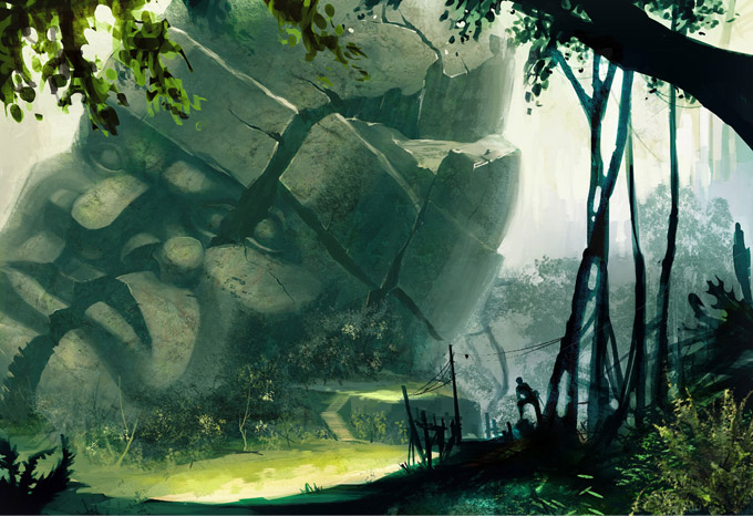
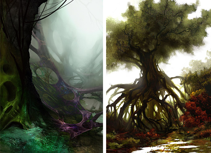
I especially like the curving, strange looping style f these trees, as they seem slightly alive and dominant.
Friday 2 March 2012
Broken Statue Face - Concept

Continuing with the Idea that this 'UFO wreckage' will seem like an ancient relic, undisturbed and overgrown, I decided to attempt some 'speed painting'. However, I lost any notion of 'speed' and just tried to focusing on capturing an environment. The design of the statue is too human at the moment, and it's texture and appearance should have slightly unnatural elements, (e.g having no nose, being made of a weird material), the more I develop the back story of the 'aliens' the more interesting their ship and any aspects of it (such as this statue) will hopefully seem.


Original Attempt ^
Subscribe to:
Posts (Atom)